Difference between revisions of "Talk:Targeting Challenge (original)/Results"
Darkcanuck (talk | contribs) (→Table problem?: looks fine) |
m |
||
| (One intermediate revision by the same user not shown) | |||
| Line 13: | Line 13: | ||
== Table problem? == | == Table problem? == | ||
| − | Anyone experienced the same problem as me? I use Firefox 3.0.10 with my special [[User:Nat/ | + | Anyone experienced the same problem as me? I use Firefox 3.0.10 with my special [[User:Nat/monobook.css|user css]] (I don't really know it is my user css that work or anyoone touch wiki-wide css) My browser doesn't seem to render some table border, such as the one between Fhqw and HTTC, or the horizontal border between CassiusClay and DCResearch etc. Is this my css fault? » <span style="font-size:0.9em;color:darkgreen;">[[User:Nat|Nat]] | [[User_talk:Nat|Talk]]</span> » 14:32, 28 April 2009 (UTC)\ |
: Everything appears normal here with the standard site-wide css and FF 3.0.9 --[[User:Rednaxela|Rednaxela]] 04:11, 30 April 2009 (UTC) | : Everything appears normal here with the standard site-wide css and FF 3.0.9 --[[User:Rednaxela|Rednaxela]] 04:11, 30 April 2009 (UTC) | ||
: Looks fine to me, using FF 3.0.10. --[[User:Darkcanuck|Darkcanuck]] 04:13, 30 April 2009 (UTC) | : Looks fine to me, using FF 3.0.10. --[[User:Darkcanuck|Darkcanuck]] 04:13, 30 April 2009 (UTC) | ||
| + | |||
| + | : Thanks, it seem to be my user css problem (just correct the link above). I hate the site-wide css since the text is too large so I smaller-ize it. This is what I see: | ||
| + | :[[Image:Wrongtablestyle-tcresult.jpg]] | ||
| + | : (EDIT: I know later that I set my FF to zoom out one steps. Weird that I don't know when I set it) | ||
| + | :» <span style="font-size:0.9em;color:darkgreen;">[[User:Nat|Nat]] | [[User_talk:Nat|Talk]]</span> » 04:56, 30 April 2009 (UTC) | ||
Latest revision as of 05:59, 30 April 2009
This page needs the targeting type abbreviations list from below the results table. Regarding the topic "wowie" on the initial post - I hope you used the table converter for this? I like the border style here, I might update the table convert to use that. --Voidious 20:00, 14 November 2007 (UTC)
- I did, but it was still large. The table has collapsed borders, and a 85% font size. I forgot about the abbv list. --Chase 21:58, 14 November 2007 (UTC)
Trimming data
Would anyone mind to much if I trimmed the data to at most 2 decimal places, and the few 100 scores to 100.0? That was we can even out and neaten up the rows somewhat. --Chase 07:32, 25 March 2009 (UTC)
- A bit late to respond here, but of course not, go right ahead. I doubt any of these results are accurate to 3 decimal places, anyway. =) --Voidious 14:14, 28 April 2009 (UTC)
- Alright, trimmed, have to find a easy way to center align the actual data. I don't want to edit every single row and add in CSS manually. --Chase 22:41, 29 April 2009 (UTC)
Table problem?
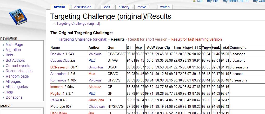
Anyone experienced the same problem as me? I use Firefox 3.0.10 with my special user css (I don't really know it is my user css that work or anyoone touch wiki-wide css) My browser doesn't seem to render some table border, such as the one between Fhqw and HTTC, or the horizontal border between CassiusClay and DCResearch etc. Is this my css fault? » Nat | Talk » 14:32, 28 April 2009 (UTC)\
- Everything appears normal here with the standard site-wide css and FF 3.0.9 --Rednaxela 04:11, 30 April 2009 (UTC)
- Looks fine to me, using FF 3.0.10. --Darkcanuck 04:13, 30 April 2009 (UTC)
- Thanks, it seem to be my user css problem (just correct the link above). I hate the site-wide css since the text is too large so I smaller-ize it. This is what I see:

- (EDIT: I know later that I set my FF to zoom out one steps. Weird that I don't know when I set it)
- » Nat | Talk » 04:56, 30 April 2009 (UTC)